
From PowerPoint to Powerful: Designing eLearning Your Students Will Actually Remember
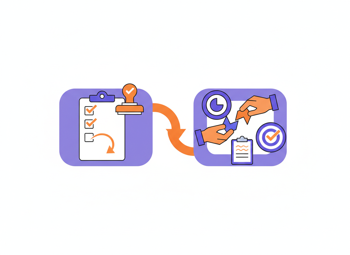
Ask anyone who has slogged through compliance training online how they actually get through it, and you'll usually hear some version of the same confession: click, click, click, next, next, next. And if there's a quiz at the end, screenshot the questions, get a few wrong, and go back with the right answers already in hand to pass on the second try.
That's not learning. That's ticking a box.
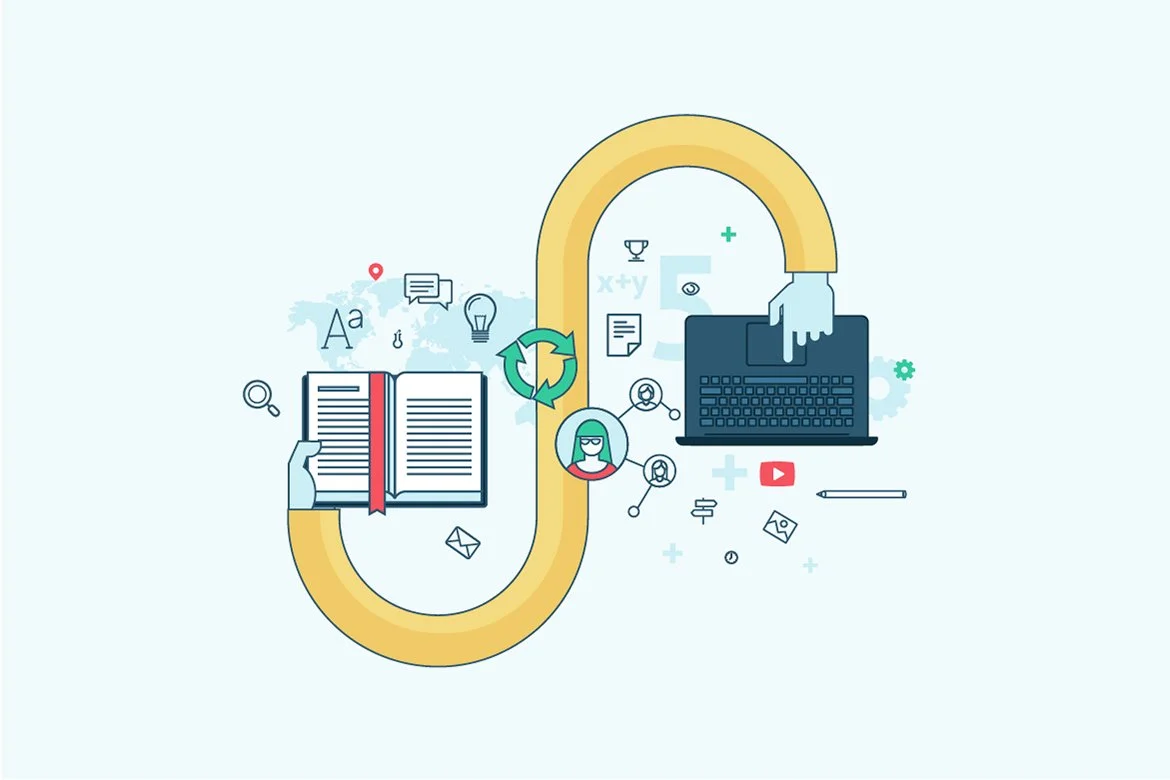
It happens because most e-learning is built the same way: take the PowerPoint or the learner guide, drop the content into an authoring tool more or less as-is, and bolt a quiz on the end. Being presented with information doesn't equal learning, and in the VET sector, where we need people to actually be able to do something with what we've taught them, that gap matters more than most.
Here's how we turn a flat PowerPoint into e-learning students genuinely engage with — and remember.
Start With the Verb, Not the Heading
Before you touch your authoring tool, go back to your original PowerPoint or learner guide and ask: what should someone be able to do after this section? Then rewrite the slide title as that action, not the topic.
“Customer Service Principles” becomes “Identify Customer Service Principles.” “Privacy Fundamentals” becomes “Apply Privacy Fundamentals.” “Warning Signs” becomes “Identify Warning Signs.”
The verb tells you what interaction to build. If the outcome is to identify something, that might be a matching or hotspot activity. If it's to choose an appropriate response, that lends itself to multiple choice or a scenario. Deciding the verb first means you're designing the activity around what students need to do, rather than retrofitting an interaction onto a slide because the tool has a nice template for it.
Chunk It, Don't Dump It
Attention spans are shrinking, thanks in no small part to social media, and most people can hold focus on one topic for about three to seven minutes before they need something to break it up. If students are reading text for three minutes straight with nothing to do, you've lost them.
So take that mega-topic (nine slides on customer complaints, say) and break it down by task rather than by topic: acknowledge the complaint, identify the solution, follow through. Each mini-section gets its own hook, its own model of good practice, and its own activity, sitting inside that three-to-seven-minute window. A simple progress graphic, icons that go from greyed-out to full colour as each step is completed, gives students a visual cue for where they're up to, and keeps cognitive load low.
Keep mobile in mind too. Articulate Rise handles responsive design reasonably well; slide-based tools like Genially or Storyline don't, and your learners are increasingly going to attempt at least some of this on a phone.
Hook, Model, Then Let Them Try
Within each chunk, the same simple structure holds up again and again:
Hook: explain why this matters right now — a short video of something going wrong, or a prompt: “you've walked into the store and someone's been mopping the floor with no sign out …”
Model: show what good performance looks like, in context — not as a wall of bullet points.
Safe, guided attempt: give students a low-stakes activity to try it themselves, with feedback.
That last point matters: these engagement activities don't need a 100% first-go success rate. If someone gets it wrong, the goal is to give them the information and feedback so they can move on having actually learned something, not to punish them or block their progress. Save the hard checkpoint for a proper quiz at the end of the section.
Let Them Make Decisions
The most effective way to make any of this stick is to stop telling students what the right answer is and instead let them find out for themselves. Scenarios and, where your tool supports it, branching scenarios, put students in a situation, give them a genuine decision to make, and then show the consequence of that decision before they move on.
A branching video scenario works well here: play a short clip, ask students to decide what happens next, and if they choose wrong, loop them back to try again with feedback rather than just marking it incorrect and moving on. It takes longer to build than a page of text. It's also the part that actually sticks with people.
Five Habits Worth Breaking
Content dump. Slide after slide of dense text with a “continue” button is still a content dump, no matter how nice the template looks. Break it up, use imagery, and lean on your continue button as a deliberate pause point, not just a mechanism to keep scrolling.
Click-to-reveal for everything. It's tempting to hide information behind a click because it feels more “interactive,” but overused click-to-reveal hides information — and with 100%-completion requirements, we've seen students get genuinely stuck simply because they didn't realise there was something to click. Reserve it for content that supports one specific decision, not as your default layout.
Interaction as decoration. “We haven't had a picture in a while, let's stick some hotspots on one” is not meaningful engagement. Every interaction should exist because it serves the learning, not because the screen looked bare.
No consequences. A scenario without a consequence is just a multiple-choice question with extra steps. Build in a debrief — what happened, why, and what the better choice would have achieved.
Videos as lectures. A one-hour webinar works because it's live and you can ask questions as you go. A self-paced learner won't sit through an hour of talking-head video. Keep content videos to 60–90 seconds, demonstrations under four minutes, and if a demo genuinely needs to run longer, chapter it or cut it into pieces.
Getting Video Right
Video earns its place for physical task demonstrations, sensitive topics, and building rapport — particularly in self-paced courses where students never meet a live trainer. Seeing the same presenter show up consistently across a course builds trust, even without any real interaction between them.
Two things we'd flag from experience. First, always provide a transcript alongside closed captions — most video tools (Zoom, Loom, Vimeo) will generate a VTT or SRT file for you, and if yours doesn't, upload the video to Vimeo or YouTube to generate one. It's a straightforward accessibility win and gives students who don't engage well with video a readable alternative.
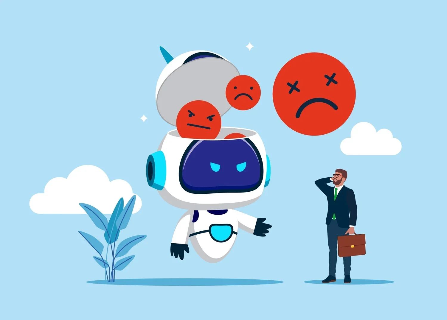
Second: think twice about AI avatar presenters. We recently worked with an RTO during an audit who had invested significantly in AI avatar content, and the student feedback was blunt — they hated it, and disengagement went up. AI voiceover tools (we use Eleven Labs) are improving and can be a good option if live voiceover isn't practical, but for now, a real person still beats what feels like mass-produced content.
Let AI Do the Heavy Lifting
Two places AI has genuinely sped up our build process, without cutting corners on quality:
Storyboarding: instead of building a separate storyboard document from scratch, mark up the original PowerPoint or Word document directly with comments — “this needs to be a video,” “turn this into a scenario” — and that marked-up document becomes your storyboard. It's dramatically faster than a full parallel document, and it's exactly what we now do as standard practice.
Building interactions: you can describe an interactive scenario or game to an AI chat tool — topic, tone, compliance context, the decision you want students to make — and have it generate the HTML, which then drops straight into a code block in Rise (or Canva, which also supports embedded code now). Ask for changes conversationally, swap out any broken images, and you have a custom interaction built in minutes rather than hours. The more detail you give it, the better the result.
None of this replaces good instructional design judgement, you still need to know what you're asking for, but it removes a lot of the production friction that used to make scenario-based content too time-consuming to build for every topic.
The Bottom Line
Engagement was never about animations, avatars, or how many things students can click on a screen. It's about meaningful effort: giving students a reason to think, a decision to make, and feedback on what they chose. Take your existing PowerPoint, rewrite the titles as verbs, chunk it into three-to-seven-minute pieces, hook-model-practice each one, and build in real decisions with real consequences wherever you can. That's the difference between content students click through and training that actually changes what they do at work.
Want more info?
Want the full session, including the live demonstrations in Genially and Rise, and the AI prompts used to build the scenarios above? Purchase the recording of From PowerPoint to Powerful: Designing Genuinely Engaging eLearning Content here. We are partnering with VETQI to provide our webinar recordings, and the link will take you to the VETQI website, where you'll also find other recordings available from VETNexus and Digital Literacy Licence.
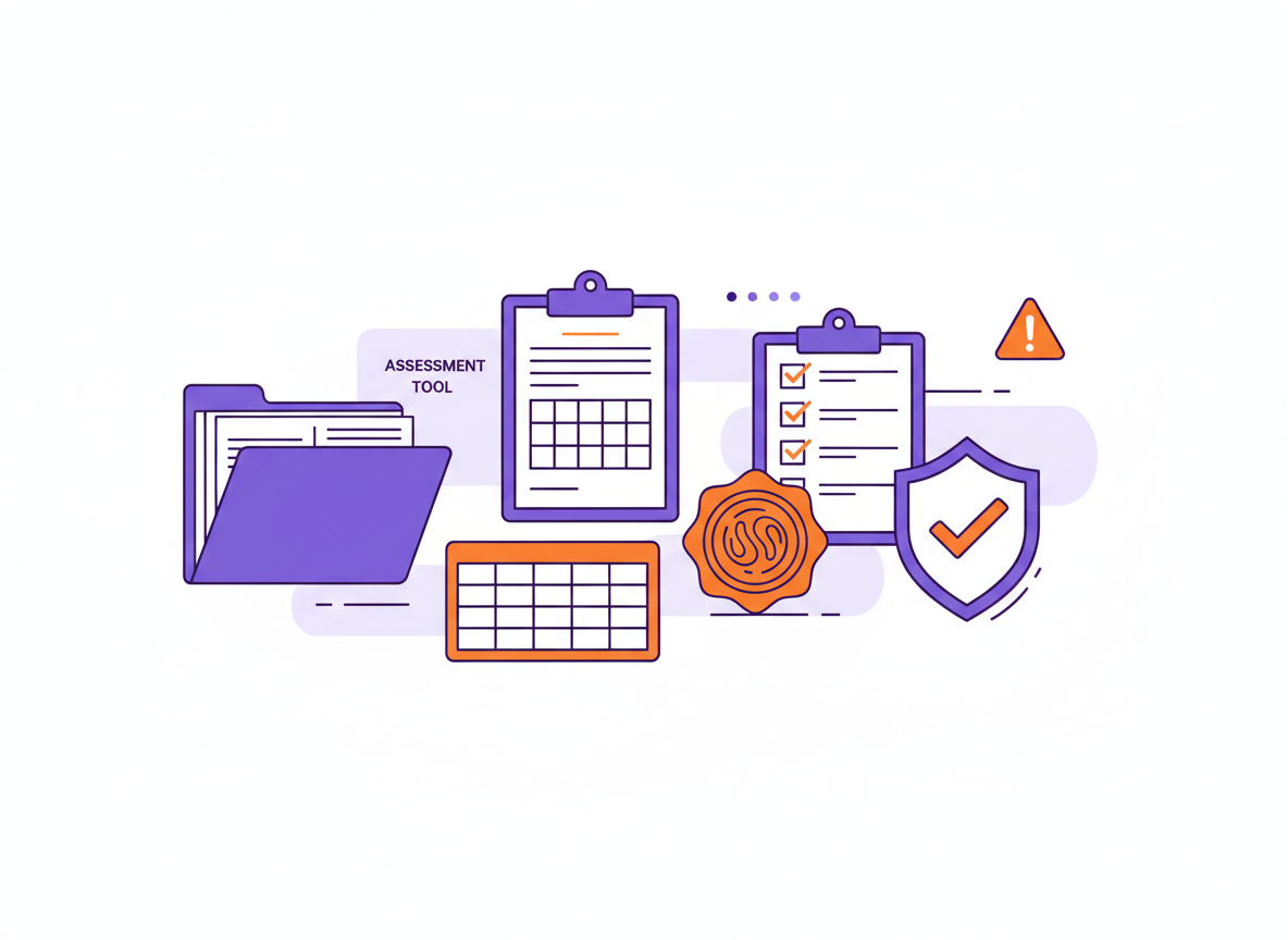



Registered Training Organisations (RTOs) are increasingly relying on AI-generated quizzes uploaded to a Learning Management System (LMS) – a quick AI prompt, a neatly generated quiz, and up it goes, job done. Except…it isn’t.
While AI-generated assessments can be comprehensive and substantively sound, simply uploading them to an LMS without thoughtful adaptation often results in poorly designed, generally non-compliant assessment tools.